top of page


2023


Branding Logo Final Design and Development Process
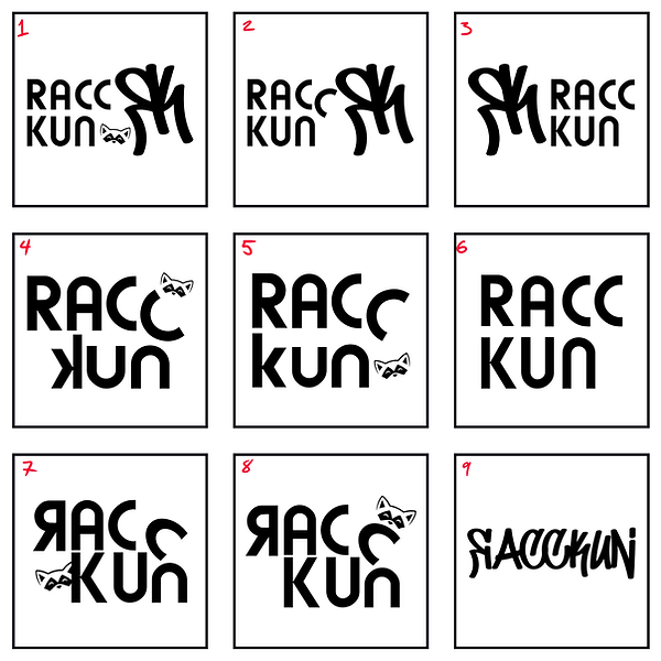
(1-13) - Originally I wanted to include my original 'ЯK' logo into the design - as the design progressed I felt the different fonts of 'racckun' and 'ЯK' were too different and didn't work well together. I also wanted to include a little raccoon character into it as well, but couldn't really find great places to place it. With these first drafts I felt most of them were either unbalanced or lacked personality and felt too generic.
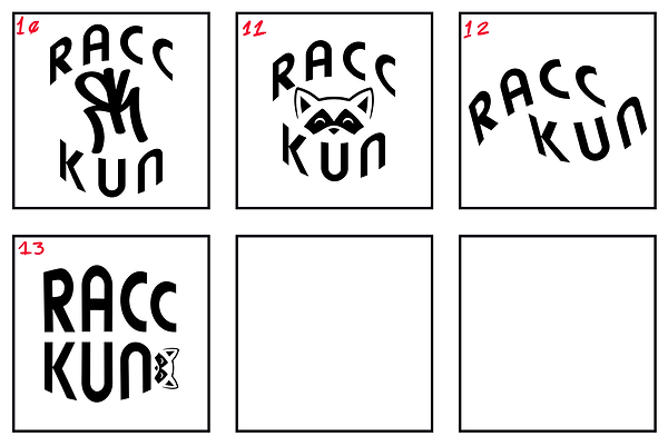
(14-21) - Rohan (a friend) had the idea to try to make some of the letters of 'racckun' into the body and tail of the raccoon character, and I played around with the idea in the next drafts. I either felt that the letters weren't legible enough or still looked a little off, but I liked the direction.
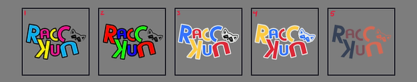
(22-25) - In the following drafts, I kept the idea of the 'C' and 'n' being part of the raccoon character, but kept them more neat and legible and didn't add anything to the letters themselves. I tried to keep the R and the K connected in a few of these designs, but they felt too stiff when compared to the other letters that are more tilted and askew.
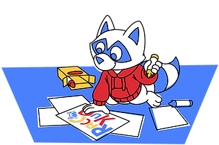
(1-5 Gray) - I finally landed on design 24 - the direction I wanted to go with my logo was something with personality - something more 'playful' and 'toy-like'. I came up with a few different palettes, but felt 4 was more in line with my ideas.
(Final, Top) - I adjusted the letters a little bit more and the colors, and got the final design


bottom of page